Hello 👋 I'm Dan.

I do Cloud DevOps and write PHP. I also care about web performance and security.

RRDtool Graph for Nagios' check_disk Command

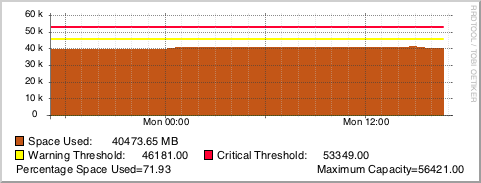
Over the past few months I’ve been working more and more with RRDtool, and since we use GroundWork at work, I thought I’d start to better the default graphs that come with GroundWork. One of the graphs I thought needed the most improvement is the graph for check_disk. See the old graph below:

The original GroundWork/RRDtool graph for disk usage.
The new and improved graph for disk usage!

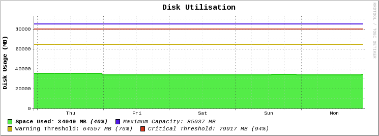
Along with my other graphs, I will be using the Outlined Area Graphs colour set for my graph areas and lines.

Without further ado, here is the code for the graph:

rrdtool graph - \
-E \
-P \
-h 180 \
-l 0 \
--grid-dash 1:2 \
-t "<big><b>Disk Utilisation</b></big>" \
-b 1024 \
-X 0 \
-a PNG \
-v "<b>Disk Usage (MB)</b>" \
DEF:diskCurr=rrd_source:ds_source_0:AVERAGE \
DEF:diskWarn=rrd_source:ds_source_1:AVERAGE \
DEF:diskCrit=rrd_source:ds_source_2:AVERAGE \
DEF:diskMax=rrd_source:ds_source_3:AVERAGE \
CDEF:diskPerc=diskCurr,diskMax,/,100,* \
CDEF:cdefDisk=diskCurr \
CDEF:cdefw=diskWarn \
CDEF:cdefc=diskCrit \
CDEF:cdefm=diskMax \
CDEF:warnPerc=diskWarn,diskMax,/,100,* \
CDEF:critPerc=diskCrit,diskMax,/,100,* \
AREA:diskCurr#54EC48:"<b>Space Used\:</b>\g" \
LINE2:cdefDisk#24CB14: \
GPRINT:diskCurr:LAST:" <b>%.0lf MB</b>\g" \
GPRINT:diskPerc:LAST:" <i><b>(%.0lf%%)</b></i>" \
LINE2:cdefm#4D18E4:"<i>Maximum Capacity\:</i>\g" \
GPRINT:cdefm:LAST:" <i>%.0lf MB</i>\n" \
LINE2:cdefw#C9B215:"Warning Threshold\:\g" \
GPRINT:cdefw:AVERAGE:" <i>%.0lf MB</i>\g" \
GPRINT:warnPerc:LAST:" <i>(%0.lf%%)</i>" \
LINE2:cdefc#CC3118:"<i>Critical Threshold\:</i>\g" \
GPRINT:cdefc:LAST:" <i>%.0lf MB</i>\g" \
GPRINT:critPerc:LAST:" <i>(%.0lf%%)</i>\n" \
-c BACK#FFFFFF \
-c CANVAS#FFFFFF \
-c GRID#C0C0C0 \
-c MGRID#404040 \
-c ARROW#FFFFFF \
-Y
  • rrdtool graph - — this will tell rrdtool that we’re making a graph, and the output will go to stdout (needed for GroundWork, otherwise you can put something like disk_usage.png).
  • -E — aka --slope-mode gives the graph a more organic and natural look.
  • -P — uses Pango markup to render all text with HTML, so you can use tags like <b></code> or <code class="inline"><i>. There are more available, you can check out Pango Reference Manual.
  • -h 180 — this sets the height of the graph to 180 pixels.
  • -l 0 — this sets the lowest number (or limit) of the Y-axis to 0, because obviously, a storage device can’t have a negative capacity.
  • --grid-dash 1:2 — gives us nice and small dotted lines for the graph.
  • -t "<big><b>Disk Utilisation</b></big>" — the title for the graph, with Pango-supported HTML to make the title bigger and bolder (as the tags would suggest).
  • -b 1024 — as we are dealing with storage capacity, we measure the data in base2.
  • -X 0 — disables the unit exponent scaling for this graph.
  • -a PNG — formats the output of the graph as a PNG. Depending on what setting you have, it could impact some other settings (i.e. --no-gridfit).
  • -v "<b>Disk Usage (MB)</b>" — this sets a vertical title on the left-side of the Y-axis.
  • DEF:diskCurr=rrd_source:ds_source_0:AVERAGE — this defines a variable called diskCurr which is sourced from the RRD. GroundWork automatically fetches this for you. From the command line, you would manually specify both the path to the RRD, and the data source (i.e. server17.pretendco.com_ssh_disk_boot.rrd:_dev_disk0s2).
  • DEF:diskWarn=rrd_source:ds_source_1:AVERAGE — same as above, but gets the warning level for the disk (in MB).
  • DEF:diskCrit=rrd_source:ds_source_2:AVERAGE — same as above, but gets the critical level for the disk (in MB).
  • DEF:diskMax=rrd_source:ds_source_3:AVERAGE — same as above, but gets the maximum size of the disk (in MB).
  • CDEF:diskPerc=diskCurr,diskMax,/,100,* — this command (CDEF) copies the values of a variable(s), and math can be performed using rpn (Reverse Polish Notation). The standard way of writing this is diskPerc = (diskCurr / diskMax) * 100 as we are calculating the percentage used of the disk. I won’t delve into the complexities of RPN, but take a look at the Wikipedia article.
  • CDEF:cdefDisk=diskCurr — assign another variable called cdefDisk which copies the diskCurr variable.
  • CDEF:cdefw=diskWarn — as above, copy one variable to another.
  • CDEF:cdefc=diskCrit — as above, copy one variable to another.
  • CDEF:cdefm=diskMax — as above, copy one variable to another.
  • CDEF:warnPerc=diskWarn,diskMax,/,100,* — calculate the warning level as a percentage. In standard mathematics, your equation would be warnPerc = (diskWarn / diskMax) * 100.
  • CDEF:critPerc=diskCrit,diskMax,/,100,* — like above, calculate the critical level as a percentage.
  • AREA:diskCurr#54EC48:"<b>Space Used\:</b>\g" — graph the area of the variable diskCurr with the colour #54EC48, then print Space Used: in bold, with a string modifier (\g) to strip whitespace at the end of the string.
  • LINE2:cdefDisk#24CB14: — print a line on the graph that is 2 pixels thick, with the value of cdefDisk and the colour #24CB14. Note the extra colon (:) at the end, this means we’re not printing any string in the legend (below the graph).
  • GPRINT:diskCurr:LAST:" %.0lf MB\g" — print the last value of diskCurr as an integer with MB at the end.
  • GPRINT:diskPerc:LAST:" (%.0lf%%)" — print the percentage of the disk used. Note the double percentage, the first percentage symbol escapes the second symbol (so RRDtool doesn’t think we’re trying to print a number).
  • LINE2:cdefm#4D18E4:"Maximum Capacity\:\g" — draw a line on the graph that represents the maximum capacity of the storage device.
  • GPRINT:cdefm:LAST:" %.0lf MB\n" — print the maximum capacity of the storage device in megabytes (MB).
  • LINE2:cdefw#C9B215:"Warning Threshold\:\g" — draw a line on the graph that represents the warning threshold of space used.
  • GPRINT:cdefw:AVERAGE:" %.0lf MB\g" — print the warning threshold in MB.
  • GPRINT:warnPerc:LAST:" (%0.lf%%)" — print the warning threshold as a percentage.
  • LINE2:cdefc#CC3118:"Critical Threshold\:\g" — draw a line on the graph that represents the critical threshold of space used.
  • GPRINT:cdefc:LAST:" %.0lf MB\g" — print the critical threshold in MB.
  • GPRINT:critPerc:LAST:" (%.0lf%%)\n" — print the critical threshold has a percentage.
  • -c BACK#FFFFFF — change the background colour of the graph to #FFFFFF (white).
  • -c CANVAS#FFFFFF — change the canvas colour (the actual graph itself) of the graph to #FFFFFF (white).
  • -c GRID#C0C0C0 — change the grid colour to #C0C0C0 (light gray).
  • -c MGRID#404040 — change the major grid colour to #404040 (dark gray).
  • -c ARROW#FFFFFF — change the arrow colours to #FFFFFF (white) to hide them.
  • -Y — enables the nice dynamic Y-axis grid that gives you whole numbers and ensures you don’t have too many horizontal lines that could make the graph messy or hard to understand.

You can also take a look at the gist for the code.

Enjoy!

PSA: Fake ATO Refund Phishing Email

This morning I received an email purportedly from the Australian Tax Office (ATO) which, at first, excited me (I had just woken up) because I was getting another refund! Hooray! But… there’s always a catch. Upon actually reading the email I noticed several red flags which made me realise that the email is in fact, a phishing email.

The phishing email as seen on my Mac.

First off, the refund amount is listed as AUD. Given the Australian Tax Office operates only in Australia, there is no reason that they would have to specify what currency the refund amount is in, are they all of a sudden going to refund in USD, EUR? I don’t think so. Secondly, the website is cloudaccess.net, not ato.gov.au. The Australian Tax Office would never use another domain for any of their pages.

The last paragraph makes mention of an SSL certificate, yet the resource for the aforementioned link is http, not https (which all secure websites should be). Given how the banks have been training people to look out for the lock for some years now I think this would be a obvious red flag for many people.

The goofballs who made the email even used @ato.com.au as the reply email address. Any Australian resident who uses the internet should know that the Australian Tax Office is a government branch, and will use the .gov.au TLD, not .com.au

For more details regarding the Australian Tax Office and online security, I recommend checking out the ATO’s article titled “Online Security” as it contains examples of past scams, and how to identify a fraudulant email.

Stay safe out there!

Folder Size Monitoring with Nagios and RRDtool

The RRDtool graph in GroundWork.

Recently at my place of employment we’ve had a few customers have their log folders explode in size and crash their servers. Since we already monitor OS X Servers using GroundWork, I decided to write my own folder size Nagios plugin checks folder sizes that alerts if they get too large, and returns performance data for use with RRDtool.

Bash Hokery

The Bash script called check_folder_size.sh (which can be obtained at the GitHub repo) should be uploaded to any folder on the OS X Server you want to monitor.

To test the script, cd into the directory where the Bash script is, then you can test it doing ./check_folder_size.sh -f /Library/Logs -w 1024 -c 2048.

Your required flags for the Bash script are:

  • f — the path for the folder you want to get the size for (wrap the path in " double quotes if there’s a space)
  • w — the warning level (in MB).
  • c — the critical level (in MB).

And the one optional flag, which shouldn’t be used for this particular Nagios plugin, is:

  • m — block size for the folder (e.g. k for KB, m for MB and g for GB)

For your service check command line, enter something like this: check_by_ssh_folder_size!/Library/Logs/!m!1024!2048. See below:

  • check_by_ssh_folder_size — this is my command in Nagios for the check.
  • !/Library/Logs — the folder path for sizing up.
  • !m — we want return data in MB.
  • !1024 — the warning level in MB.
  • !2048 — the critical level in MB.

RRDtool Doo-Hickey

Below is the RRDtool create command (this is used in GroundWork, but may be used for other platforms)

$RRDTOOL$ create $RRDNAME$ --step 300 --start n-1yr $LISTSTART$ DS:$LABEL#$:GAUGE:95040:U:U DS:$LABEL#$_wn:GAUGE:95040:U:U DS:$LABEL#$_cr:GAUGE:95040:U:U $LISTEND$ RRA:AVERAGE:0.5:1:8640 RRA:AVERAGE:0.5:12:9480

And below is the RRDtool update command for each check that is performed. Here we update the RRD file with the last check time, the folder size in MB, the warning level and critical level.

$RRDTOOL$ update $RRDNAME$ $LASTCHECK$:$VALUE1$:$WARN1$:$CRIT1$ 2>&1

Finally, we have the RRDtool graph command that generates a nice, custom graph for visual output of performance data.

rrdtool graph - \
--slope-mode \
--height 180 \
--grid-dash 1:2 \
--title="Folder Size" \
--base 1024 \
--units-exponent 0 \
--vertical-label "Size (in MB)" \
--imgformat=PNG \
DEF:a=rrd_source:ds_source_0:AVERAGE \
DEF:w=rrd_source:ds_source_1:AVERAGE \
DEF:c=rrd_source:ds_source_2:AVERAGE \
CDEF:cdefa=a \
CDEF:cdefw=w \
CDEF:cdefc=c \
AREA:a#54EC48:"Space Used" \
LINE:cdefa#24BC14: \
GPRINT:a:LAST:"Current\: %.0lf MB" \
GPRINT:a:AVERAGE:"Average\: %.0lf MB" \
GPRINT:a:MAX:"Maximum\: %.0lf MB\n" \
LINE2:cdefw#ECD748:"Warning Threshold\:" \
GPRINT:cdefw:LAST:"%.0lf MB" \
LINE2:cdefc#EA644A:"Critical Threshold\:" \
GPRINT:cdefc:LAST:"%.0lf MB\n" \
CDEF:cdefws=a,cdefw,GT,a,0,IF \
AREA:cdefws#ECD748 \
CDEF:cdefcs=a,cdefc,GT,a,0,IF \
AREA:cdefcs#EA644A \
-c BACK#FFFFFF \
-c CANVAS#FFFFFF \
-c GRID#C0C0C0 \
-c MGRID#404040 \
-c ARROW#FFFFFF \
-Y

Explanation of the RRDtool graph

  • rrdtool graph - this will tell rrdtool that we’re making a graph, and the output will go to stdout (needed for GroundWork, otherwise you can put something like folder_size.png).
  • --slope-mode - this gives the graph a nice organic look, rather than the default step-like lines.
  • --height 180 - make the graph 180 pixels in height.
  • --grid-dash 1:2 - this will make the grid lines slightly dashed (1:3 ratio will make a dotted line).
  • --title "Folder Size" - gives the graph a nice large title.
  • --base 1024 - as we are graphing storage, we want the numbers in base 2.
  • --units-exponent 0 - this will prevent automatic y-axis scaling (it messes up my graph).
  • --vertical-label "Size (in MB)" - puts a label on the left-hand side of the graph (text is printed vertically).
  • --imgformat=PNG - format the output image as a PNG.
  • DEF:a=rrd_source:ds_source_0:AVERAGE - set a variable a with the value of the folder size in MB.
  • DEF:w=rrd_source:ds_source_1:AVERAGE - set a variable w (warning) with the warning level value.
  • DEF:c=rrd_source:ds_source_2:AVERAGE - set a variable c (critical) with the critical level value.
  • CDEF:cdefa/w/c=a/w/c - define more variables for later calculations.
  • AREA:a#54EC48:"Space Used" - define an area on the graph with the variable (a), and the colour (#54EC48) (colour is made with rgb components) and a legend “Space Used”.
  • LINE:cdefa#24BC14: - graph a line at the top of the main area.
  • GPRINT:a:LAST:"Current\: %.0lf MB" - print the text “Current: XXX MB” to the graph (on the same line as the text “Space Used”) which has the most recent rrd entry.
  • GPRINT:a:AVERAGE:"Average\: %.0lf MB" - print the text “Average: XXX MB” to the graph (on the same lines as the other text so far), which displays the average in MB.
  • GPRINT:a:MAX:"Maximum\: %.0lf MB\n" - print the text “Maximum: XXX MB” to the graph, along with a newline character at the end.
  • LINE2:cdefw#ECD748:"Warning Threshold\:" - draw a warning level line on the graph, with the rgb colour.
  • GPRINT:cdefc:LAST:"%.0lf MB" - print the warning level in MB.
  • LINE2:cdefc#EA644A:"Critical Threshold\:" - draw the critical level line on the graph.
  • GPRINT:cdefc:LAST:"%.0lf MB\n" - print the critical level in MB, along with a newline character.
  • CDEF:cdefws=a,cdefw,GT,a,0,IF - using a calculated define, we can work out if the folder size is larger than the folder size, and if it is, we’ll change the graph colour on the next line.
  • AREA:cdefws#ECD748 - using the calculation above, change the colour of the graph.
  • CDEF:cdefcs=a,cdefc,GT,a,0,IF - like above, do another calculation to see if the folder size is larger than the critical level.
  • AREA:cdefc#EA644A - as above, colour the graph to the appropriate colour if it reaches or goes over the critical threshold.
  • -c BACK#FFFFFF - change the background colour of the graph to white (#FFFFFF).
  • -c CANVAS#FFFFFF - change the colour of the graph canvas to white.
  • -c GRID#C0C0C0 - change the grid colour to a light-ish grey.
  • -c ARROW#FFFFFF - change the colour of the graph arrows to white, to hide them all together.
  • -Y - scale the graph to integers dynamically on the graph’s Y axis.

Once you’ve got this all set up, you should be getting wonderful graphs (like the one above), along with performance data.

My Favourite Album: OutRun by Kavinsky

For the past few months I’ve been listening to the album OutRun by Kavinsky. This album is a great driving album, and a wonderful programming mix. As a fan of 80s and 80s inspired music, this album blends the best of modern French house music, with the classic sounds of 80s electro.

Kavinsky’s production style is very visceral and reminiscent of video game music and film soundtracks of the 80s.

- Last.fm Profile Page

The first track, Prelude, introduces the main character, a young male along with a red Ferrari Testarossa. After the introduction track we get the track 2 in the album, Blizzard, a punchy track with awesome synth-guitar riffs. This is easily one of my favourite tracks of all time, and certainly my favourite of the album. The guitar riffs combined with the hard-hitting bass drum kicks help set the tone of the album and Kavinsky’s style. Next, we get Protovision, another punchy track with an epic bass kick and fantastic synth lines. To me, Protovision is very reminiscent of the first Justice album, the stiff micro-sampled sounds make me think of tracks like Newjack, Phantom and DVNO. Fourth on the album is Odd Look, the first proper song of the album with vocals. Like the two preceding tracks, this song follows the trend of strong bass kicks and epic synth chords that are guaranteed to get anyone moving on the dance floor, or the office.

Next up is my second favourite track on the album, Rampage. Combining the mid and high-range synths with the solid bass drum kick, along with a muffled-sounding piano in the background, this is a fun track. I can imagine this track would be really epic when tied with a tough mission in a game like Call of Duty. After Rampage we get the rap track… Suburbia. While I can appreciate rap and hip-hop, I don’t really like the blend of rap and the 80s electro-synth this album is. Having said that, the story in the rap track does follow the theme of the album, talking about the character and his fast “Mars Red” Testarossa. After the rap track we have another punchy synth track, Testarossa Autodrive. I love the powerful synth riffs in this track, combined with the high-pitched synth that kicks in throughout the track, it’s a winner.

Nightcall, the eighth track in the album has great vocals and a sequenced synth. The robotic vocal doing the first part of each verse reminds me of Daft Punk’s robo-voice. I also find the female voice in the chorus to be hauntingly beautiful, combining great lyrics with a fantastic voice, I get chills every time I hear the chorus. Next up is Deadcrusier, a great warpy synth track with great deep synth riffs proving a nice bassey edge to the track. The warpy sounding synth hits home an epic track. Next is Grand Canyon, another of my favourite tracks. The super hard-hitting high-hats and synth lines make this track and epic track to listen to. I could easily listen to this track over and over again, the repetition of the track is catchy as heck!

After Grand Canyon is the track First Blood, an almost Van Halen influenced track with epic guitar lines. With a rock-themed vocalist and synth-guitar sounds this track is a rock epic. I have a feeling the solo was very Eddie Van Halen inspired. Next up is Roadgame which starts off with a great violin loop which changes pitch throughout the loops in the song. Combined with great synths and bass kicks, this is a fantastic track to bring us near the end of the album. Finally is Endless, the last track of the album brings the poignant story to a close with a nice piano loop and soft synths with a slow kick drum beat. The album is over :(

Oh yeah, and there’s a video game.

Please note that this is my first album review, my writing is sure to get better!

Working with OS X Caching Server's Max Cache Size Limits

The Caching Server pane in Server.app

Added in a recent version of OS X Server was the ability to provide an advanced software update feature called Caching Server. This enhanced the previous Software Update server features by including content from iTunes (i.e. iOS app updates and iBooks), along with providing an easy way for automatic server update selection (for those who are unfamiliar with Caching Server’s nifty features, check out the PDF on this page).

During setup you are required to select a volume for the cached updates to be stored. Depending on the size of this volume, the maximum size used slider can be rather useless. For example, when configuring my RAID enclosure (which has 8.8TB of useable space), the slider went from 30GB to 580GB in one step! This kind of limited selection is very frustrating. I want more than 30GB of cached updates, but I don’t want 580GB! Unfortunately, the current GUI slider steps in very high increments. Thankfully for us, using serveradmin through the terminal will save us.

If you want to see what limit Caching Server has set via the command line, you can do sudo serveradmin fullstatus caching then check out the line caching:CacheLimit. This number is shown in bytes and will convert nicely to a base 10 unit (otherwise known as SI), rather than the normal base 2.

For example, if you wanted to set a limit of 100GB, you would use the number 100000000000. That’s a lot of zeroes. Alternatively, 250GB would be 250000000000. To work out your storage conversion needs, I’d recommend checking out this converter here and use the Byte SI Decimal Prefix to convert to bytes.

Now that we’ve decided on how much space we’d like to use for Caching Server, lets tell it what we want. Open up a new Terminal window and using the command serveradmin settings caching:CacheLimit we can specify (in bytes) how much space we want to use. In my case, I wanted to use a maximum of 100GB for Caching Server. To do this, I enter the following:

sudo serveradmin settings caching:CacheLimit = 100000000000

After pressing return and running fullstatus on Caching Server (or opening the Caching tab in the Server app), you can now see that a maximum of 100GB will be used. Naturally, entering a different number will yield a different result in Server app (or the Terminal), but you get the picture.

SABnzbd+ for Status Board

Since making the iStat Server for Status Board script I’ve wanted to make more graphs for Status Board. Lo and behold, I use SABnzbd+ and it has an API. A graph is born:

SABnzbd Categories.
SABnzbd Categories.

The above graph collates all the downloads in the queue and counts them up then graphs them out, it’s pretty self explanatory really. Along side those bar graphs is the total of all items in the queue. Also available is a custom “Do-it-yourself” panel with core information about your SABnzbd+ server.

SABnzbd Info.
SABnzbd Info.

This pane is also pretty self explanatory. At the top you’ve got the version number of SABnzbd+, the current speed of your downloads, the status of the server (i.e. paused, downloading etc), and the size (in GBs) of what’s left to download in the queue. At this point in time, the info pane is only suitable for a 4x4 panel.

Jump over to the GitHub page to take a gander at the code and download it. Getting it set up is pretty easy, but if you’re stuck, I can provide limited support on the GitHub page, or via Twitter.

Please take a look and let me know if you find it useful!

iStat Server Graphs for Status Board (Updated)

Ever since Panic’s Status Board for iPad app came out I’ve wanted to have data from iStat Server appear in Status Board.

After finding that iStat Server stores its data in /Library/Application Support/iStat Server/databases/local.db and that the SQLite database and all its data is not encrypted/obfuscated in any way, I figured it wouldn’t be too difficult to get the juicy data into some sexy Status Board graphs.

Using the PDO and SQLite libraries included with Mac OS X 10.8.3 I was able to get a connection to the database and pull out rows. Simply store this file anywhere on your Mac that’s accessible by the built-in web server.

Lo and behold, a graph is born:

iStat Server for Status Board - CPU Graph.

The project is still in its infancy, with only a few different graphs. I plan on slowly adding more and more graphs and types. As of this post, the following graphs are possible:

  • ram_hour - RAM usage for the past 60 minutes
  • ram_day - RAM usage for the past 24 hours
  • cpu_hour - CPU usage for the past 60 minutes
  • cpu_day - CPU usage for the past 24 hours
  • load_hour - CPU load for the past 60 minutes
  • load_day - CPU load for the past 24 hours
  • temp_hour - Temp sensors for the past 60 minutes *new*

Take a look at the GitHub repo for more details and the download link to get this puppy running. Limited support can be provided on GitHub or on Twitter at @yesdevnull.

Update - 05/06/2013

Todays big update includes temp sensor monitoring so you can get more pretty graphs, like below.

iStat Server for Status Board - Temperature Graph.

If you’re checking 1 sensor, make your query string &temps=TC0D, or for multiple sensors, do &temps=TC0D,TC0H. If you have multiple temp sensors, they must be comma delimited. For the most up-to-date list of sensors, check the README in the GitHub repo.

Head over to the GitHub repo (linked above) to check out the new changes and get it set up on your Mac!

Mac NetBoot Bash Scripts

Recently I’ve been working on some bash scripts for a NetBoot system we have at work for diagnosis and troubleshooting Macs.

Currently the collection only includes a script for the command-line utility memtest, and a simple CPU workhorse yes. Also included is a few bash aliases you can add to your bash profile.

To view the collection, or fork et al, visit GitHub now!

Welcome

Welcome to my new site yes > /dev/null!

Here I’ll be writing about code I’ve written, technical experiences I’ve had, music I work to, and maybe even other things unrelated to computers and programming.

I’m planning on doing a couple posts per month, so check back soon for some nifty content.

Dan.

1 2 3 14 15